
hitoiki
Project Overview
The project involves the designing the landing and product pages for tea websites in both English and Japanese versions. This task requires a deep understanding of cultural nuances and preferences in visual aesthetics and functionality for both regions. This project's objective is to facilitate the global expansion of the online store.
Key Data
Role: Visual designer
Timeline: 3 weeks
Tool: Figma, Photoshop
The Process
Process 1: Conducting design/cultural research
Process 2: Sketching
Process 3: Creating wireframe
Process 4: Design for both versions
Process 5: Final design
The User
US version: Targeted to the user who likes to get authentic Japanese tea and matcha or exploring new types of tea for their collections.
JP version: Targeted to the user who enjoys the higher grade of tea and matcha for themselves or friends as the gifts.
Cultural Research
Competitive Analysis
I initiated the project with a research phase focused on understanding the distinctions between website designs in the US and Japan. Analyzing the same company website across both regions provided valuable insights, guiding the development strategies.

US Version

JP Version
Moodboard For Both Versions
To ensure consistency in my designs for both versions, I created a moodboard before starting the design. My primary focus was on infusing Japanese essence into the design elements while evoking the feeling of classic and minimalistic.

Design Process
2 Different Layouts
I began by creating low-fidelity mockups to make sure the viability of the structures for both versions.
US version: Considering the common tendency for users to follow the Z-pattern while navigating websites, I designed the layouts for US websites with the title positioned on the left side and the corresponding content on the right.
JP version: I chose to present the text vertically, aligning with the traditional reading direction of the Japanese language, which is top to bottom in columns. The title was positioned on the right side, with each new column starting to the left
US Version

JP Version

Typography For Each Verions
US version: I utilized Baskerville for headings and Open Sans for body text. Baskerville conveys sophistication and warmth through its smooth curves and balanced letterforms. On the other hand, Open Sans exudes modernity and friendliness with its clean and open letterforms. The seamless combination of these two typefaces effectively captures the essence of hitoiki
JP version: I chose to use Noto Serif JP for both headings and body text. The slightly curved letterforms of this typeface impart a sense of warmth, while the serif lends a subtle Japanese aesthetic to the theme. Overall, the readability of both vertical and horizontal lines is highly commendable.
Problems
Challenge : JP Wireframe Did Not Work
In my initial wireframe for the Japanese version, I placed the title on the right side of the website. However, upon further consideration, I realized that this placement did not adhere to either the Z or F patterns commonly followed in website design. Consequently, I needed to reconsider an idea that captures a be a Japanese mood while also ensuring functional effectiveness.
Solution
To gain insights into the user experience from a Japanese perspective, I conducted tests with a few Japanese individuals using my original mockup. Their feedback indicated that the layout is confusing in terms of where to focus. Consequently, I made the decision to relocate the title to the left side, mirroring the layout of the US version.
Final Designs
Final Wireframe
In the final stage of website design, my focus was on refining and polishing the designs while ensuring that all elements were perfectly aligned. Below, you'll find the home and product pages for both the US and JP versions. Please feel free to explore the prototypes using the button below.
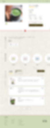
Landing Page
US Version

JP Version
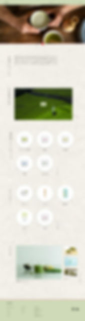
Product Page
US Version

JP Version
Lesson Learned
Cultural Differences
During the research process, I observed that Japanese websites prioritize visual elements, often favoring detailed hero pictures over simple images, a practice commonly seen on US websites. This analysis led me to understand why Japanese websites frequently do not place a call-to-action button in their hero section. From this experience, I learned that providing the right designs can empathize with users from different cultures and encourage them to stay on the page.
Reasons For Everything
For the designs, my goal was to authentically capture the essence of Japanese culture. To achieve this, I incorporated shoji paper, traditionally used in tea ceremony rooms of the past, to create the Japanese theme. Additionally, I placed the flower-shaped decorative knot, often employed to present money gifts on celebratory occasions, to convey the concept of rewarding oneself. These experiences led me to realize that having a rationale behind all decisions helps shape the brand identity.